Colorimetry
Here the concepts of colour measurement and computation shall be introduced.
The relationships which are used for measurement and specification of colours constitute most important experimental data on human colour vision, for the properties of the eye are the natural basis of any colour measurement.
Basics of colour measurement
Light coming from somewhere, entering the eye and leading to the sensation of colour, is called the colour stimulus. Besides colour, we realize whether the object we look at is emitting light itself or whether it remits light coming from another source, we see if it is transparent or opaque, we see whether the surface is mat or glossy and can discriminate different kinds of gloss, however, all the attributes except colour and brightness are determined through the combined action of impressions of neighbouring parts of the object and its surroundings. Using some diaphragm to restrict the view to a small part of the object which looks uniform, then colour and brightness are the only attributes we can assign.
The light, i.e. the colour stimulus can be analyzed with physical means. By a prism or a diffraction grating it can be decomposed into parts of different wavelengths, and it can be measured how much power is transported in different ranges of wavelengths.
The scale of wavelengths is divided into small intervals Δλ.
The power (energy per unit time) which flows in such a wavelength-interval from λ − Δλ/2 to λ + Δλ/2
into a certain solid angle (which may be given by the pupil of the observer's eye) is called
φλΔλ (1)
Knowing φλ for all visible wavelengths, thus for each interval Δλ, this is a function of the wavelength λ, namely the spectral power distribution or spectral function
which contains all the physics of the colour stimulus.
One finds that a doubling of
φλ for all wavelengths increases the brightness, but does not change the colour; if only the colour is of interest, one therefore arbitrarily normalizes this function. Then the functions of light sources of different radiative power can be compared in the same plot. (For colour measurement, this is even more facilitating, as only relative measurements are necessary which are much easier than absolute ones.)
Figure 1 shows the black-body radiation functions for different temperatures as an example.
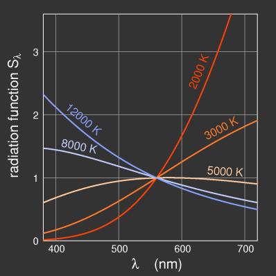
Figure 1:
The black-body radiation functions for different temperatures, showing how the radiated power depends on the wavelength. By arbitrarily fixing the value at 560 nm to unity the curves fit into one diagram. In fact, the radiated power increases with temperature for all wavelengths; the absolute values for 2000 K are everywhere below those for 12000 K.
If light is decomposed by a prism, the different-wavelength components can be superposed again, and this process restores its original colour. Thus one may always think of a colour stimulus as a sum of partial stimuli of different wavelength, and the spectral function φλ gives the amount of each small wavelength-interval.
For the radiation of light sources, the spectral function is called Sλ instead of φλ; Sλ is called the radiation function of the source.
The plausible assumption that φλ also determines the colour sensation is easily disproved. Contrast to the surrounding, adaptation to the colour and brightness of the illumination and not least the processing of the optical data in the brain may induce notable differences.
A good example for that is the abrupt change in the perceived colour of the grey sky, when in the evening light is switched on in a room. The action of contrast can be demonstrated withe the experiment of "coloured shadows". For this, one needs two different sources of light, e.g. two spotlights, one with a red filter before it and the second one without. An object held before the screen will throw a double shadow. The one which is illuminated by the red light looks red as expected, but the other one does not seem white, but greenish-blue instead.
This experiment, performed with a candle at twilight time, has been described first by Otto v.
Guericke in 1672 (Land 1977). E. H. Land describes experiments which with increased apparatus clearly show the variability of colour sensation for the same stimulus.
As colour sensations can not be measured (not yet), for the measurement of colour one only asks whether two stimuli can be discriminated or not and does not consider the sensations at all.
To eliminate any influence of the object's shape and surroundings, and to make comparison easy, the colours to be compared are presented as structureless "free" colours ("aperture colours"), each filling half of the viewing field which appears like a shining opening.
Particularly useful for the investigation of surface colours is the "Maxwellian mode of observation": looking at something with a magnifying glas, the distances can be chosen such that the whole aperture of the glass shows the same colour. For a colour which does not appear to belong to a specific object, the separation of object and illuminant colour which in most cases is performed inadvertently and with remarkable precision, is not possible any more. Comparing colours presented in that way, the experiment is reduced to the comparison of fluxes of light, of colour stimuli.
If two stimuli agree in their spectral composition, φ1,λ = φ2,λ,
they will appear equal to all observers under any conditions; this is called an isomeric match. Colour stimuli may look equal also if their spectral functions are different from each other; such a match is called metameric. Different observers may disagree in their determination of metameric matches.
To account for metamerism, i.e. the fact that different stimuli can produce the same colour sensation, one introduces the valence
V of the stimulus with respect to the specific observer. If an observer perceives to stimuli as a match, we write
V1 = V2 (2)
meaning that the two valences are equal, and nothing is implied for the stimuli.
While normal-sighted observers agree fairly well in their judgement of metameric equality, the equation above strictly holds only for the specific observer.
Now consider an arrangement for colour measurement. Half of the viewing field shows the colour to be measured, the other half is illuminated by three projectors of adjustable intensities through colour filters. By superposition (addition) of the three "measuring primaries" with properly chosen weights, the valence of the other half of the viewing field is to be reproduced. Experience shows that with red, green, and blue primaries a wide gamut of colours can be reproduced. This is a very important experimental result: all hues can be obtained as a superposition of three primaries!
Such a match is written as
V = RR + GG + BB (3)
Valences are denoted by bold capital letters, the letters R, G, B (tristimulus values) give the amounts of the primaries R, G, B, measured in arbitrary units.
There are cases where a match can not be obtained with the given arrangement corresponding to equation (3). As an example, some highly saturated bluish green might not be obtainable, the superposition of the three primaries always being less saturated, more whitish. If the comparison serves the purpose of measurement, one can manage this case by directing the red primary to the other half of the viewing field and achieving a match according to
V + GG = RR + BB (4)
This can be written as
V = RR − GG + BB; (5)
where negative amounts of primaries appear. Of course, for practical realizations, only the form of eq. (4) is possible, each side of the equation corresponding to the valence of one half of the viewing field which can be realized.
Admitting negative weights, equation
(3) holds generally, provided that it is not possible to obtain one of the three primaries as a superposition of the other two ones. This is Grassmann's First Law, which can be stated as follows: Given four colours, it is always possible to obtain one of them as a superposition of the other ones.
If there is a metameric match, an equal increase or decrease of the luminance of both conserves the match, thus
V1 = V2 ⇒ aV1 = aV2 (6)
as long as only photopic vision is involved.
Equality of colour valences also persists if the same colour is added to both:
V1 = V2 ⇒ V1 + U = V2 + U (7)
as well as
U1 = U2, V1 = V2 ⇒ U1 + V1 = U2 + V2 (8)
(Grassmann's Third Law, H. Grassmann 1853)
Having obtained the tristimulus values R1, G1, B1 and R2, G2, B2
for V1 and V2, respectively
V1 = R1R + G1G + B1B
V2 = R2R + G2G + B2B (9)
then the following holds:
V1 + V2 = (R1 + R2) R + (G1 + G2) G + (B1 + B2) B. (10)
From this we see that colour valences may be added using the same rules as for the addition of vectors. Thus a valence may be represented as a vector in the three-dimensional colour space as illustrated in figure \ref{b:4-3}. There are only three linearly independent basis vectors, just as in the physical space. Corresponding to the three-dimensionality of the space of colour sensations the space of colour valences is three-dimensional.
Represented by vectors, two colours given by vectors in the same direction differ only in their brightness, while the chromaticity is given by the direction of the vector.
Until now, nothing has been said about the units used to specify tristimulus values. They may be chosen arbitrarily; conventionally they are chosen as follows: one unit of each of the red, green, and blue (violet-blue) primaries added gives three units of white, where white is assumed to be the valence of the equal-energy spectrum
φλ = const. Because of equation (6) the absolute value of the units in unimportant, only the relative strengths are fixed in that way.
1/3 (R + G + B) = E
(11)
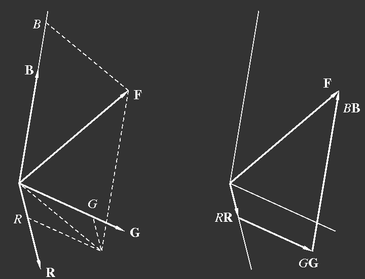
Figure 2:
Representation of a colour valence
F as a sum of three components.
R,
G,
B are unit vectors,
RR
etc. then are vectors in the direction of the unit vectors, but with changed length.
F is the sum of
RR,
GG and
BB. The figure to the right illustrates the vector addition. In these sketches,
R,
G,
B are the weights of the components,
RR,
GG, and
BB are the component vectors.
The weight of a colour valence relevant for additive mixing is the number of trichromatic units, and this is just the sum of the components: two units of colour A plus three units of colour B yield five units of the mixed colour C.
As in many cases the brightness is of less interest than chromaticity, one often prefers to use a simpler two-dimensional representation of colours, plotting the unit plane R+G+B=1, the chromaticity being given by the coordinates of the points where the valence vectors intersect this plane. This is illustrated by figures 3.
From R, G, B one obtains the coordinates of the intersection point:
r =
R/(R + G + B), g =
G/(R + G + B), b =
B/(R + G + B)
(12)
and as r + g + b = 1, only two of the coordinates have to be specified. For a point in the colour triangle one can read off the coordinates from the distances of the point to the triangle's sides, where the unit is given by gthe corresponding height of the triangle (e.g. g = (distance F–V)/HG).
As the angles between axes in figure 3 are arbitrary,
the colour triangle may be drawn in arbitrary shape, equilateral or with a right
angle for convenience.
Adding two colours represented by points in the plane, the resulting colour will lie on a line connecting the points, and the distances are inversely proportional to the amounts (in trichromatic units) of the components as shown in figure 4.
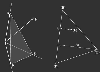
Figure 3:
Left: the colour triangle in colour space: the chromaticity of the valence
F drawn as an arrow is given by the point where the arrow intersects the plane of the triangle. Right: the unit plane with the intersection point (F) of the valence
F.
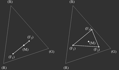
Figure 4: Additive mixing of two or more colours: if the trichromatic units of colours
F1,
F2,
… to be mixed are used as "masses", the chromaticity (M) of the result is given by the centre of mass.
The luminosities of typical primaries R, G, B are remarkably different. The standard primaries for colorimetric purposes are monochromatic light sources of wavelengths λR = 700 nm, λG = 546,1 nm, λB = 435,8 nm. In this case one unit of red is seen as bright as 15 to 20 units of blue, while four to five units of red are needed to match the brightness of one unit of green.
However, to compare the brightnesses of different colours is not easy, and so one has to interpret the given luminosities of the standard sources as values taken from the sensitivity function Vλ (figure 5) which has been defined for the "standard observer" and represents the average obtained from a large number of normal-sighted test persons.
For the wavelengths given above, the relative luminosities are
lR = 1, lG = 4,5907; lB = 0,0601 (13)
and from this one obtains the luminosity L of some coloured light of valence R, G, B as
κL = lRR + lGG + lBB (14)
Here κ is a factor which may be chosen such that L is obtained in the appropriate units, e.g. cd/m2, candela per square meter.
The above equation relies on the assumption that luminosities are additive (Abney's law). This is, so to say, part of the definition of luminosities.
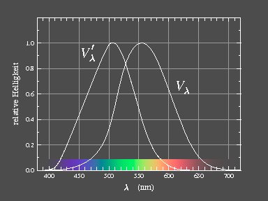
| 
| Figure 5: Relative luminous efficiency functions for daylight Vλ and for night vision V'λ.
|
It is further remarkable that the radiated power is also quite different: for one trichromatic unit, one has
SR : SG : SB = 72,0962 : 1,3791 : 1 (15)
Computation of chromaticity
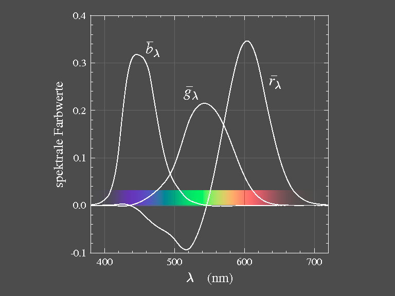
The trichromatic weights (tristimulus values) of light of one single wavelength (monochromatic light) are of particular importance: for radiation of wavelength λ (stimulus qλ) one has
‾rλ, ‾gλ, ‾bλ.
These weights measured for all values of λ (keeping the radiated power fixed), the quantities
‾rλ, ‾gλ, and ‾bλ
are functions of λ and are called colour matching functions (figure
6). Having the colour matching functions, the tristimulus values for any given colour stimulus
φλ can be computed.
|
| Figure 6: The colour matching functions are the tristimulus values of the monochromatic primaries:
λR = 700 nm, λG = 546,1 nm,
λB = 435,8 nm.
|
To do this we divide the range of wavelengths of visible light into small intervals Δλ. If the intensity in a certain interval were just one unit, the trichromatic coordinates for this part would be
‾rλ, ‾gλ,‾bλ and therefore we get
‾rλφλΔλ, ‾gλφλΔλ, ‾bλφλΔλ. (16)
Summing up all parts we obtain
R =
∑λ‾rλφλΔλ,
G =
∑λ‾gλφλΔλ,
B =
∑λ‾bλφλΔλ. (17)
The chromaticity coordinates rλ, gλ, and bλ
(which are the intersection points of the spectral valences with the unit plane) are obtained from equation (12) as
rλ =
‾rλ/(‾rλ + ‾gλ +‾bλ),
gλ =
‾gλ/(‾rλ + ‾gλ +‾bλ),
bλ =
‾bλ/(‾rλ + ‾gλ +‾bλ). (18)
The set of all these chromaticities forms the spectral locus, figure 7.
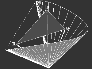
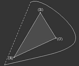
Figure 7: Left: The valence vectors of monochromatic spectral stimuli form a kind of cone in colour space, which forms the outer boundary of all possible colours.
Right: The locus of spectral colours in the chromaticity plane is the intersection of the spectral cone with the unit plane. The connection of the long- and short-wavelength ends is called the purple line. All possible chromaticities are within the area delimited by the spectral curve and the purple line.
It is obvious that only the generalized form of equation (3) with one or two negative weights is applicable when mixing spectral colours from real primaries: one always has to desaturate the spectral colour to obtain a match.
Additive mixing of the spectral colours of the end-points of the spectral locus (deep red and blue-violet) yields colours on the purple-line which connects the end-points. All chromaticity coordinates of real stimuli are within the area surrounded by spectral locus and purple line.
The chromaticity plane with the spectral locus gives another possibility to characterize a colour valence Q which has been introduced by Hermann von Helmholtz and corresponds to the perceptional quantities hue and saturation (figure 8):
One defines a "white point" W and draws a straight line through the points (Q) and (W) which intersects the spectral locus in the point (S).
There are two cases to distinguish: if (Q) lies between (W) and (S), then Q can be obtained by adding W (white light) to monochromatic light of wavelength λS. Thus there is a wavelength λf = λS of the same hue.
If, in the other case, (W) lies between (Q) abd (S), then W (white) can be obtained adding Q and light of wavelength λS'. Now, λc=λS' is called "compensating wavelength".
Saturation is defined in the first case as the by the ratio
pQ = (QW)/(SW) (19)
in the other case
pQ = (QW)/(PW)(20)
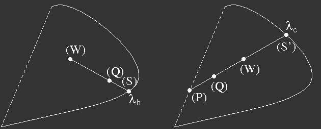
Figure 8: Determination of Helmholtz' parameters
Instead of compensating wavelength the term complementary wavelength is also used.
A pair of colours is called complementary, if they can be superposed with suitable weights to yield white.
Choice of a new set of primaries
It is easy to go over from one set of primaries to another one. This may be necessary for comparing different measurements. The geometric visualisation of valences by vectors may be helpful.
Let R', G', B' be the new primaries which can be expressed in terms of the old ones:
R' = a11R + a12G + a13B (21)
and correspondingly for G' and B'.
If one wants the valence W (white) to be represented by equal units of each of the new primaries, one may have to scale the new vectors first to satisfy
1/3 (c1R' + c2G' + c3B') = W (22)
where for W the equal energy white E can be chosen, or the valence of daylight D65 etc., depending on the circumstances. This is a set of equations for the unknowns c1, c2, and c3 which has to be solved. After that, the new primaries are redefined as
R' : = c1R',
G' : = c2G',
B' : = c3B',
(23)
which means that the coefficients a11 ... a33 are adjusted.
To express the old primaries by the new ones, equations (21) are solved treating R, G, B as unknowns. The solution has the form
R = b11R' + b21G' + b31B'
…(24)
Thus a colour valence can be written as
Q = RR +GG + BB = R'R' + G'G' + G'G'
= R (b11R' + b21G' + b31B')
+ G (b12R' + b22G' + b32B')(25)
+ B (b13R' + b23G' + b33B')
and one can read off how the coordinates are to be transformed:
R' = b11R + b12G + b13B
G' = b21R +b22G + b23B (26)
B' = b31R + b32G + b33B
Transforming the spectral colours, we obtain the colour matching functions for the new primaries
‾r'
λ = b11‾rλ + b12‾gλ + b13‾bλ (27)
etc.
The transformation of the chromaticity coordinates r = R/(R+G+B) etc. is easily obtained and shall not be given here.
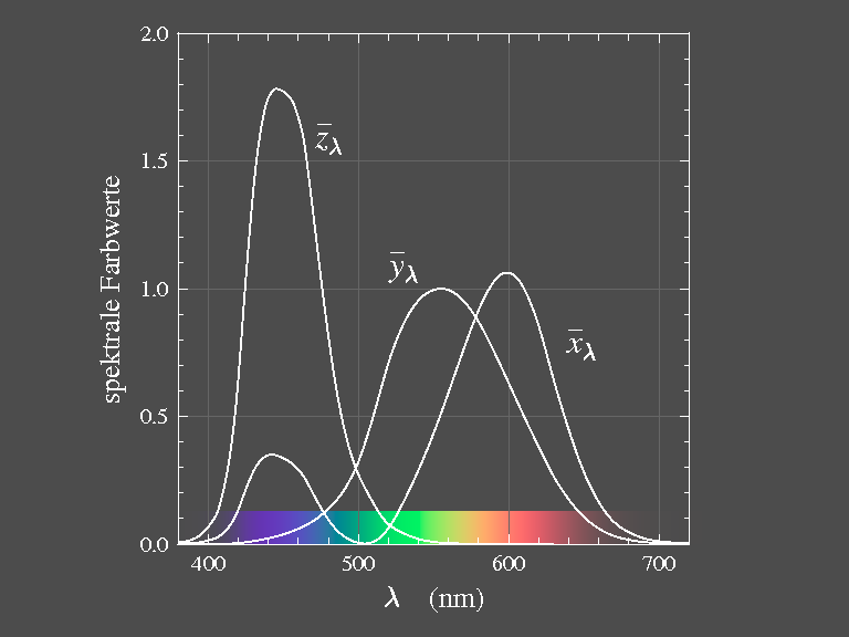
The standard observer
As the three colour matching functions
‾rλ, ‾gλ, ‾bλ allow to compute the valence of any colour stimulus, they contain the complete information on colour perception of the particular observer. Colour perception in the sense of ability to discriminate; we do not deal with the subjective sensation of colour here.
The colour matching functions determined for different people will, however, in general show differences, sometimes only slight, sometimes marked ones. (This is due to differently strong yellow pigmentation of the macula and also the lens of the eye, and also differences in the visual pigments themselves.) Even for one observer, the functions depend on the size (angular extension) of the viewing field due to the yellow pigment in the macula.
To provide a basis for colour measurement and specification, the CIE (International Commission on Illumination, Commission Internationale de l'éclairage) has in 1931 introduced a fictitious standard observer, based on measurements of Guild (1931/32) and Wright (1928/29) which have been obtained with the monochromatic primaries of λR = 700 nm, λG = 546,1 nm, λB = 435,8 nm
and a viewing field of 2°. These colour matching functions are shown in figure 6. Later measurements with improved technology (Stiles 1955) confirmed the older results.
The simple possibility to transform tristimulus values induced the CIE in 1931 to introduce special virtual primaries X, Y, Z and to define the tables of the corresponding colour matching functions as standard for colorimetry.
The new primaries X, Y, Z have been chosen such that no negative tristimulus values X, Y, Z occur for any colour. In the unit plane, the spectral locus is then entirely within the triangle
(XYZ) which naturally implies that the valences
X, Y, Z can not be realized, they only supply a convenient coordinate system for measurements and graphical representation.
Equation (14) gives the luminance for any valence vector. If we put L=0,
then
0 = lR R + lG G + lB B (28)
is the equation of a plane in colour space, the locus of all valences with luminance zero. The primaries X and Z have been assumed to lie in that plane, thus lX = lZ = 0, and the colour matching function of the valence Y then must be proportional to the photopic luminous efficiency function Vλ, thus the coordinate Y proportional to the luminosity.
The requirements that
E = 1/3 (X + Y + Z) (29)
and that the XYZ-colour space encompasses the gamut of real colours as closely as possible have been used to fix the valences X and Z and thus to get the colour matching functions ‾xλ, ‾yλ, ‾zλ as transforms of ‾rλ, ‾gλ, ‾bλ.
The unit plane in this space is the CIE 1931 chromaticity diagram.
As the shape of the triangle is arbitrary, the usual choice is the most convenient one, namely rectangular isosceles, as shown in figure 9.

Figure 9: The CIE 1931 chromaticity diagram with the locus of spectral colours and the purple line. The wavelengths of spectral colours are given in nm.
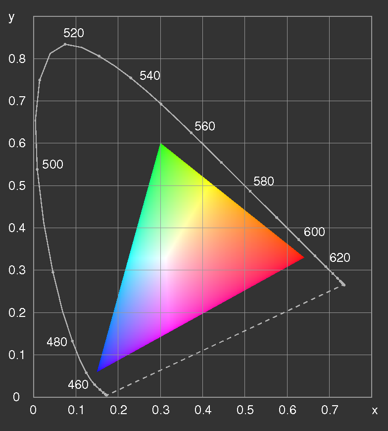
Figure 10: The
CIE 1931 chromaticity diagram with the gamut of the sRGB primaries. The sRGB white point is D65. If displayed on a screen conforming to the sRGB standard, the colours should be correct, otherwise not.
To give an impression of the colours in the diagram, figure 10 shows the sRGB gamut which is de facto standard for the World Wide Web in the internet, see http://www.color.org/sRGB.html.
The computation of tristimulus values from a colour stimulus φλ with respect to
X, Y, Z is done in complete analogy with equations (17)
using the colour matching functions ‾xλ, ‾yλ, and ‾zλ,
figure 11:
X = k∑λ‾xλφλΔλ,
Y = k∑λ‾yλφλΔλ,
Z =k∑λ‾zλφλΔλ. (30)
As the functions
‾xλ, ‾yλ, ‾zλ are arbitrarily normalized (such that the maximum of ‾yλ is equal to 1), we have written a proportionality factor befor the summation sign.
At the wavelength λ = 555 nm (540⋅1012 Hz), the radiated power of 1 W (Watt) corresponds to a luminous flux of
683 lm (lumen) by definition (since 1979).
This number had been obtained from the previous definition of the unit of luminous flux by means of the black-body radiation and Planck's formula. Thus, if one chooses k = Km = 683 lm/W, then Y is the luminous flux in units of lumen, if φλ is the radiant flux per unit of wavelength.
The chromaticity coordinates are given by
x = X / (X + Y + Z),
y = Y / (X + Y + Z),
z = 1 − x − y. (31)
Because of lx = lz = 0, ly = 1, the expression L = lxX + lyY + lxZ
for the luminosity becomes
L = Y . (32)
The colour matching functions have been determined for a viewing field of
2° and hold up to an opening angle of approximately
4°. (The opening angle of 2° corresponds to a disc of 1 cm diameter viewed at a distance of 29 cm.)
For those cases where larger viewing fields are important, in 1964 matching functions and valences for 10° opening angle have been defined, based on measurements of
Stiles \& Burch (1959) and Speranskaya (1959). These quantities are given an index "10", such as X10, … ‾x10,λ, X10 etc.
Surface colours and colour filters
In the foregoing discussion we always started from the colour stimulus φλ, i.e. from the spectral composition of the light entering the pupil. If φλ
is due to the emission of a light bulb or another source of light, or by a lamp-filter combination considered as a unit, then the above results are immediately applicable.
However, mostly we encounter colours in coloured surfaces. Correspondingly, colorimetry is mainly applied to surface colours (or transparent filters) where the colour stimulus of the remitted (or transmitted) light is determined not only by the properties of the surface (or filter) but also by the illumination.
As the influence of illumination can not be separated from remission (or transmission) in the colour measurements, one must use illumination standards to achieve reproducible results. The CIE has proposed three standard illuminants A, B, C in 1931, simulating incandescent bulb light, direct sunlight at noon, and average daylight with overcast sky. B and C were later replaced by D55 and D65, given by their spectral power distribution in tabulated form. D stands for daylight, and D65 was supposed to have colour temperature of 6500 K (it is actually closer to 6504 K after a later re-evaluation of Planck's constant).
The standard illuminant A is realized by a 500 W tungsten-filament lamp driven at colour temperature 2856 K; B and C were realized by A with appropriate filters.
The quantity which is relevant for the colour of a surface is the degree of light remission as a function of the wavelength. An ideal white mat surface remits 100 % of the incident light, independently of the wavelength. The remission factor gives the ratio of light remitted compared to that of ideal white:
βλ = L/Lwhite (33)
What in the following will be said on surface colours holds for colour filters, if the remission βλ
is replaced by the transmission τλ.
Let the illuminaton be described by the spectral power distribution Sλ, which means that SλΔλ is proportional to the radiated power in the wavelength-interval from
λ−Δλ/2 to λ+Δλ/2. As the absolute value is not relevant for the present purpose, Sλ is usually arbitrarily normalized.
If the coloured surface in question is characterized by the remittanceβλ, the energy flux reaching the observer is proportional to
φλΔλ = βλ⋅SλΔλ (34)
for all wavelengths. From this one gets the tristimulus values
X = k∑λ‾xλβλSλΔλ,
Y = k∑λ‾yλβλSλΔλ,
Z = k∑λ‾zλβλSλΔλ. (35)
where the constant k usually is chosen such that for an ideal white surface one would obtain the luminance Y of 1 or 100 (percent).
k = 100 [∑λ‾yλ⋅SλΔλ]−1. (36)
Thus Y represents the luminance compared to ideal white (in percent), and this quantity is independent of the illumination level. This is important for surface colours: contrary to coloured light, where colour and brightness are perceived ad separate quantities, in the case of surfaces the luminance (as compared to white) affects the colour sensation: There is no brown light – rather a dim orange one, but a surface with the same chromaticity as orange but smaller luminosity is seen brown, not dark orange.
The fact that brown and orange or olive-green and yellow have the same chromaticities can nicely be demonstrated using two projectors. First in a darkened room one projects light with moderate intensity through an orange (or yellow) filter onto a screen; the colour seen is orange (or yellow). Then with high intensity a white ring is projected: immediately the area enclosed is seen brown or olive, respectively.
When viewing object colours, the illumination level already supplies a reference standard so that the sensation "brown" is independent of the presence of adjacent white areas.
As the valences of object colours depend on the illumination, a metameric match may get lost if the illumination changes. What is a match with one illuminant may look quite different when viewed with another one, and the difference is the more pronounced, the larger the differences in the remission curves are.
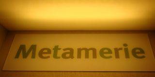
Figure 12a, b: Demonstration of metamerism. Only the ilumination is changed. (From an exposition at the
Universum® Bremen.) Click on an image for enlargement.
If a remission curve is very "irregular", the dependence of the colour on illumination may be so strong that the change in perceived colour surprises. A famous example is the precious gemstone alexandrite which at candlelight looks red, at daylight blue.
A grey area printed with cyan, magenta, and yellow ink may at incandescent lamp light look more reddish than another one printed with black ink only, while at daylight it appears bluish-greenish as compared with the neutral grey.
Colour solids
For object colours, as has been discussed, it is the relative luminance as compared to white which is decisive for the colour sensation, and not the absolute luminance which depends on the illumination. Therefore, contrary to light stimuli where the valences form an open cone, the space of object colours is bounded and forms a colour solid, figure 13. The valences of the most saturated colours seen in everyday life are somewhat inside of the surface of the solid, which is formed by the so-called "optimal colours". Optimal colours are those which for a given chromaticity (x, y, z) have the highest theoretically possible luminance Y, or, given the luminance, the highest possible saturation. It can be shown that the remission of optimal colours can only have the values zero or one, with no more than two discontinuities.
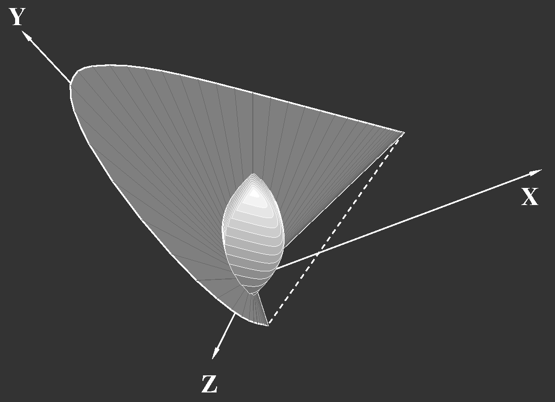
Figure 13: The solid of object colours inside of the cone spanned by the spectral valences. "Daylight" D65 has been assumed as illuminant, therefore the highest point (with
Y=1) has the chromaticity of D65. The solid is represented by cross sections of equal valence units.
Colour systems, sample collections
There have been numerous attempts to design colour solids for object colours and to produce charts for the assessment of colour. Here only two examples shall be briefly discussed, Ostwald's colour solid and Munsell's system.
Earlier attempts which are only of historical interest may be found in the internet, e.g
www.colorsystem.com.
Wilhelm Ostwald (1923) characterized colours by a hue number N and the fraction of maximally saturated colour ("full colour") F, and the white- and black-content W and K. The quantities F, W, K can be obtained from the sector sizes of the colour top as discussed in the introduction to colour science.
As F + K + W = 1, three coordinates are needed to specify a colour, e.g. N, W, and K.
The colour solid of the American painter A.H. Munsell
(Munsell 1915 and later) is based on the order of valences by hue, value (=brightness) and chroma (=saturation, intensity). Perceptionally equidistant steps have been aimed at. In this colour system, the value numbers account for the larger brightness of yellow as compared to blue. A remarkable fact is that the lines of equal hue, when plotted in the chromaticity diagram, are not straight lines in general: samples of equal hue, but different chroma do not correspond to a fixed wavelength. Samples of equal hue, but different value also have not the same chromaticity in general. This is the manifestation of two well known effects: the subjective change in hue when a colour is mixed with white (optical or with pigments) is known as Abney effect, while the apparent change in hue with changing luminosity is the Bezold-Bruecke shift.
In fact the chromaticity coordinates of the original samples of Munsell showed slight irregularities. The lines have been smoothed by improved selection of samples.
Figure 14 shows the
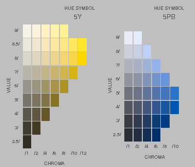 |
| Figure 14: arrangement of colours on two pages of the "Munsell Book of Color". |
The Ostwald system has been replaced by the DIN colour charts (DIN 6164) which use empirical rules for lightness and saturation to achieve perceptionally equal steps. In contrast to the Munsell system, lines of equal hue are straight lines in the chromaticity diagram; the subjective changes of hue due to the Abney and Bezold-Bruecke effects are tolerated to simplify the relation with chromaticity.
CIE-xyY-solid
Instead of constructing the colour solid in the XYZ-valence space (figure 13) it is more convenient to use the x,y,Y-space (Roesch 1928, Mac Adam
1935).
However, in both variants of the colour solid, equal distances do not correspond to equal perceptional differences, as may be seen in figure 10 which may be interpreted as view on top of that part of the
CIE-xyY-solid which can be rendered on the screen, and figure 15 which is a horizontal section through this at constant Y.
Colour distances, CIE-L*u'v', CIE-L*u*v*, …
The chromaticity coordinates x, y depend on the primaries X, Y, Z which have been chosen more or less arbitrarily. The chromaticity diagram depends on this choice; however, another choice will only lead to a "perspectivic" distortion of the diagram, accompanied by a redefinition of units such that the simple rules for computing additive mixing remain valid.
With respect to colour differences, the chromaticity chart is not quite satisfactory: the distances in the chart are not nearly proportional to perceived differences. No wonder, any perceptions beyond colour matching have until now been deliberately excluded. If now colour differences are compared, this is beyond the initial restriction.
A measure for the perceived distance may be obtained from the scattering of data points when colour matching is repeated many times. Such experiments have been performed by Mac Adam (1942). Other approaches are due to Schrödinger and to Stiles (1946).
One may chose another plane in colour space instead of the unit plane (cf. figure 3) to represent chromaticities in order to reach a better correspondence of distances to perceived colour differences. In this way the
1960 CIE-UCS diagram (UCS: uniform chromaticity scale) (also called 1960 CIE u,v-diagram) has been obtained.
The new chromaticity coordinates are obtained from x and y as follows:
u =
4x/(−2x + 12y + 3), v = 6y/(−2x + 12y + 3), (37)
and the reverse transformation is
x = 3u/(2u − 8v + 4), y = 2v/(2u − 8v + 4). (38)
The transition to the UCS-diagram is achieved by a transformation of the same kind as the transition from one set of primary valences to another one.
The UCS-diagram has been replaced by the
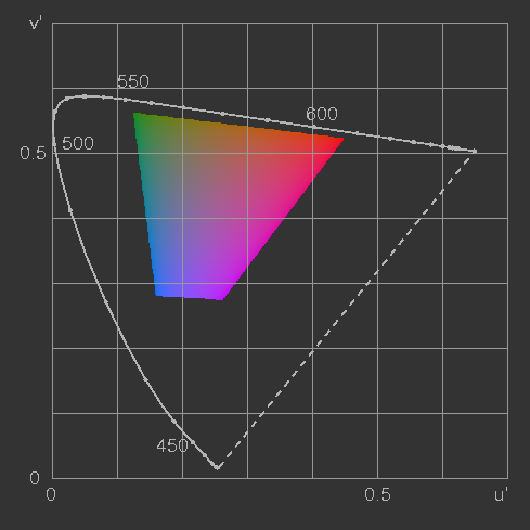
1976 CIE-L*,u',v' diagram
(L* stands for the nonlinear luminosity which shall be treated later):
u' = 4x/(−2x + 12y + 3), v' = 9y/(−2x + 12y + 3). (39)
 |  |
|
Figure 15: The CIE u'v' uniform chromaticity diagram (to be compared with figure 16)
| Figure 16:
The x-y-chromaticity diagram showing a plane of constant luminosity, the same as figure 15.
|
Perceptionally equidistant colour spaces, where equal distances imply equal perceived differences, are strictly impossible. But fortunately there are colour spaces which are closer to this ideal case than CIE-XYZ (figure 13) or CIE-xyY.
The graph shown in figure 15 satisfies the requirement quite well, as long as the luminosity is constant. If also the steps in luminosity should be perceptionally equidistant, then Y must not be used, since with increasing luminosity equal steps of Y appear smaller and smaller. The Weber-Fechner law accounts for this but does not fully describe the facts, as the adaptation to the general illumination level is not accounted for.
Supposing a low illumination level (as is usually the case when watching TV), the CIE in 1976 proposed to approximate the connection of the perceived brightness L* with the luminosity Y by a power law
L* = 1.16(Y/Yn)1/3 − 0.16 for Y/Yn > 0.008856
L* = 9.033 Y/Yn otherwise,(40)
and to obtain from the coordinates u', v' introduced above the new coordinates
u*, v* according to
u* = 13L*(u' − u'n),
v* = 13L*(v' − v'n)
where Yn; u'n, v'n are the corresponding chromaticity coordinates of the reference white-point of the screen or of the light source, respectively.
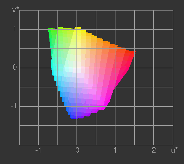
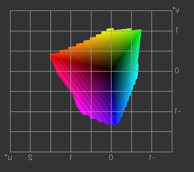
In these 1976 CIE-L*u*v* coordinates the colour space comes quite close to perceptional uniformity. The figures 17 and
18 show the part of the colour solid which can be rendered with the sRGB primaries, represented by a stack of planes of constant brightness L*.
 |  |
|
Figure 17: The colours which can be rendered by the sRGB primaries in CIE-L*u*v* space.
|
Figure 18: The previous image, seen from the back side (dark side of the colour solid in
CIE-L*u*v* space). |
One more parametrization of the colour space with somewhat simpler transformation formulas has been proposed in the same year, the
1976 CIE L*a*b* space.
The brightness L* is the same as before; the other two coordinates a*
("red minus green") and b* ("yellow minus blue") are obtained as follows:
a* = 5[f(X/Xn) − f(Y/Yn)]
b* = 2[f(Y/Yn) − f(Z/Zn)],
with
f(t) = t1/3 if t > 0.008856
f(t) = 7.787t + 16/116 otherwise
(41)
and Xn, Yn, Zn are the tristimulus coordinates of the white-point.
The back-transformation is – normalizing L*max = 1
(for Y/Yn > 0.008856)
P = (L* + 0.16)/1.16,
X = Xn(P + a*/5)3,
Y = YnP3,
Z = Zn(P − b*/2)3.
Note that vector addition to obtain the result of additive colour mixing which is possible in the CIE-XYZ space, is not possible in the L*u'v'-, L*u*v*- and
L*a*b* spaces because of the nonlinearity of the transformations. For the computation of colour mixing, one has to go back to XYZ.
Because of its approximate perceptional uniformity, the distance in the CIE L*a*b* space
Δ12 = [(L*1 − L*2)2 + (a*1 − a*2)2 + (b*1 − b*2)2]1/2 (42)
is used to specify colour tolerances.
Back to Colour Science
Continue with: Rendering Colours


)
)
)
)