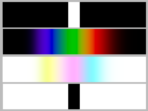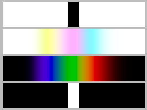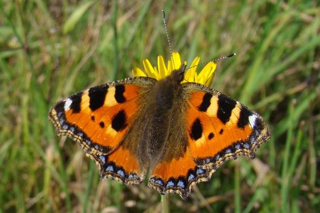
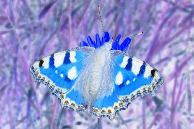
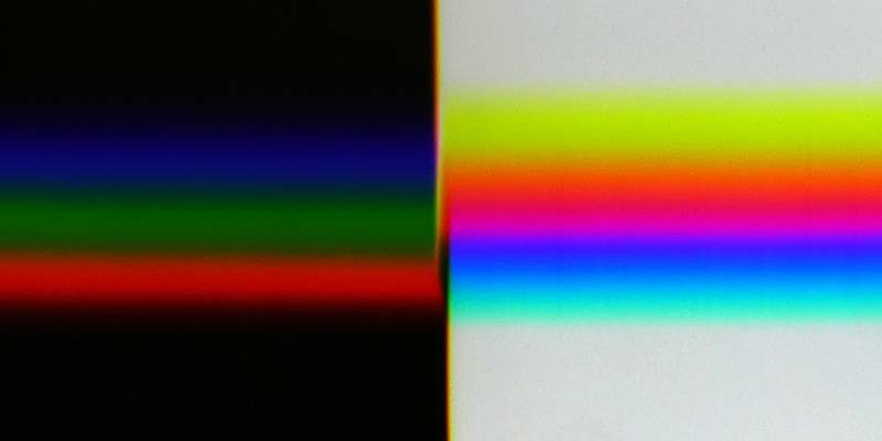
On the left the original image, on the right the image converted with an image processing program into a “negative”
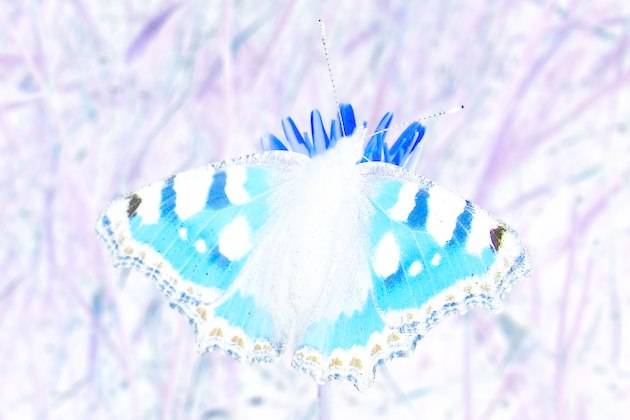
Today, when digital photography is mainly used, the negative has lost its importance. However, common image processing programs offer the possibility to convert an image into its negative. The result usually looks quite plausible. Here is an example:


The reason for investigating this was the demonstration of experiments with a prism. If one looks at a white stripe on a black background and a black stripe on a white background, the two images should behave to each other like positive and negative or, in other words, the complementary colours should be visible at corresponding positions.
The first picture in the row below shows the template, the second one shows it photographed through a prism. It should be noted that the colours seen when looking at the narrow white stripe through the prism are all outside the gamut displayable on the screen. In contrast, all colours in which the black stripe is seen on a white background are exactly reproducible. The second image can therefore only roughly reproduce what can be seen in the right half. The fourth image was created by converting the second one with an image processing program into a “negative” – it should actually look like a mirror image of the second one.
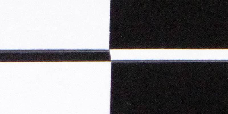
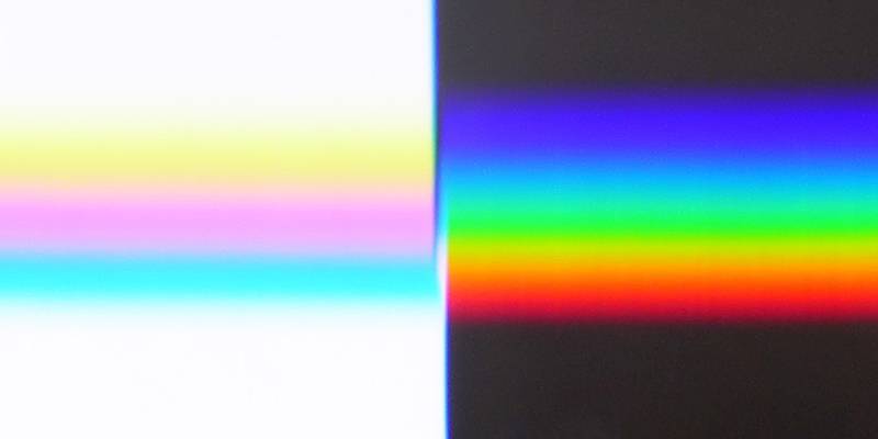
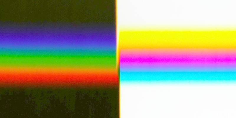
In the images, the brightnesses of R, G and B are coded for display on the screen by numbers L ranging from 0 to 255. If one replaces L each by 255 − L, one gets the inverted colours in the fourth image. This way, the reversal is done by the image editing programs.
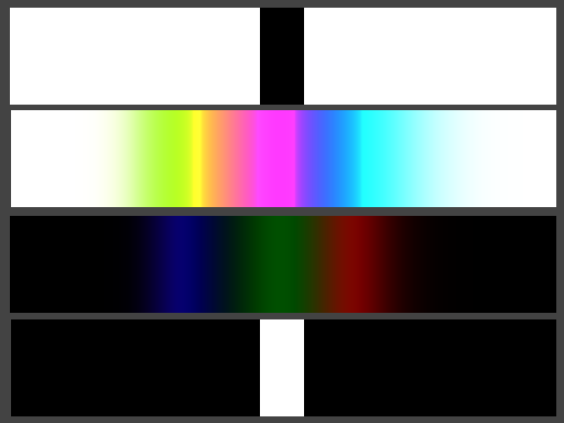
In order to obtain a correct negative, not the perceived brightness must be inverted, but the physical intensities Y, which are non-linearly related to the brightness via the so-called gamma correction. This calculation was done to get the third image in the row above. Well, it doesn't look exactly like the mirror image of the second one either, but it is more similar to it. The reason for the discrepancy is that the exact colours cannot be displayed, and for those projected into the displayable area it no longer holds that the left half of the image is the negative of the right half and shows the exact complementary colours.
Below to the right now the correct negative to the example above:

First, the image to be converted is saved in the Portable Pixmap format (ending .ppm) in binary format (as raw data). This file is to be called tempin.ppm; an initially empty file tempout.ppm must be provided for the output. The conversion is done with a small program, KonvNegP6.ps, for which you need a PostScript interpreter. Afterwards the output file is saved under a different name in the desired format. Input and output file and the conversion program must be located in the same folder where you run the PostScript interpreter.
Note on the PostScript interpreter Ghostscript (June 2021):
As of version 9.50, Ghostscript is started by default in SAFER mode, which prevents files from being read and written. This mode can be switched off by the parameter -dNOSAFER when GS is called. The corresponding command line may look like this under Windows, for example:
(The quotation marks must be used because of the space character in the path.)
I have computed a test pattern where you can check what happens when the colours are reversed. The observation of a white stripe on a black background through a prism is simulated as well as the inverse case of a black stripe on a white background.
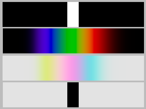
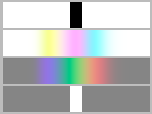
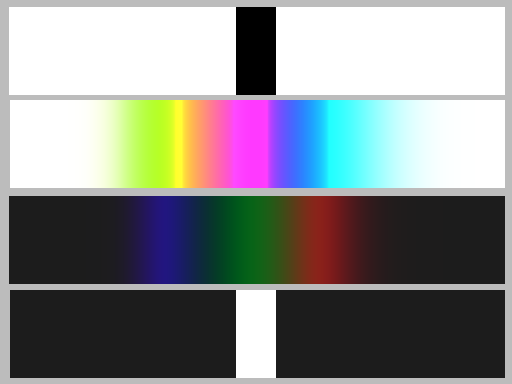
The test pattern should actually be constructed in such a way that the lower half is exactly the mirror image negative of the upper half. But since the colours in the second line are not exactly the prismatic ones, and because the brightness in the lower half had to be reduced a little bit to reproduce the resulting colours correctly, this is not the case.
In the CIE-x-y diagram on the right, the gamut that can be displayed on an sRGB screen is shown as a coloured triangle. The two curves drawn in black are the geometric loci of the colour coordinates that should be shown in the coloured stripes of the test pattern. One of them, which starts in violet blue, lies completely outside the gamut, the other one starting in white or light grey lies completely inside. This image does not say anything about the brightness.
It can also be seen from the diagram that the colours of a narrow white stripe on a black background, seen through a prism, are hardly distinguishable visually from monochromatic spectral colours. The possibility (or impossibility) of reproducing a spectrum I have already discussed. In the test image the negative values of R, G uand B were simply set to zero without correcting the brightness afterwards.
If one refrains from reducing the brightness in the lower part of the test image, thus also there from the exact colour reproduction, RGB values greater than 1 are set to 1. This corresponds exactly to zeroing the negative values in the upper part of the image. In this case, the negative therefore corresponds to the original mirrored up or down.
